

Client
Neo Systems GmbH
Sector
Branding, CGI Direction, Motion Guidelines
Industry
Consumer Electronics
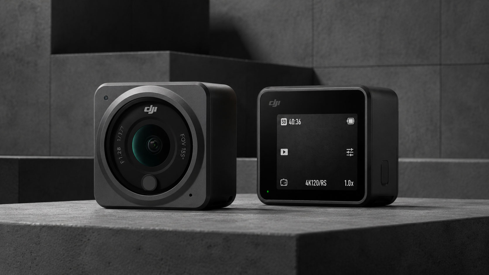
What does it mean to be product-led in a saturated market? For Neo Systems it meant starting from the object itself, letting form drive every visual decision, and building a brand that feels as precise as the hardware inside.
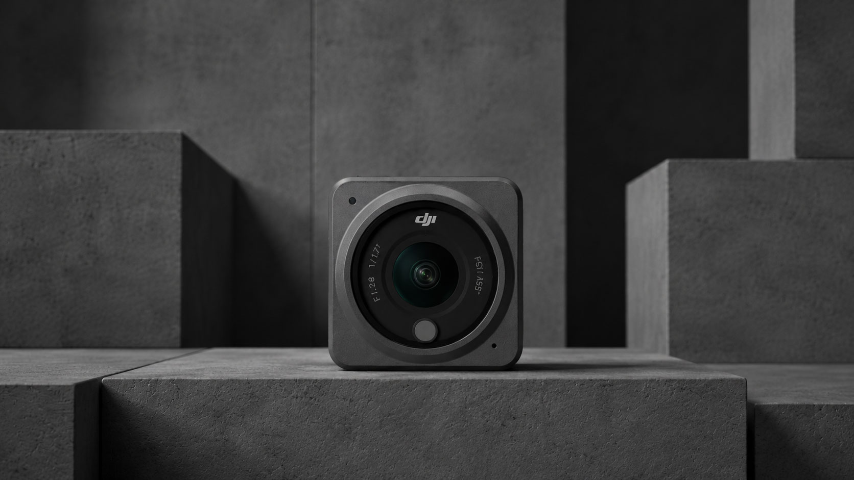
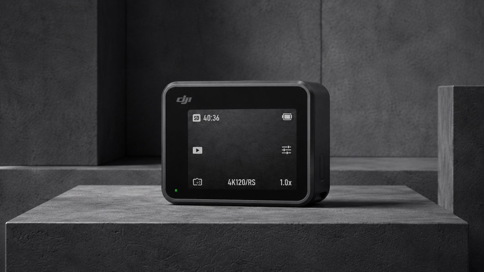
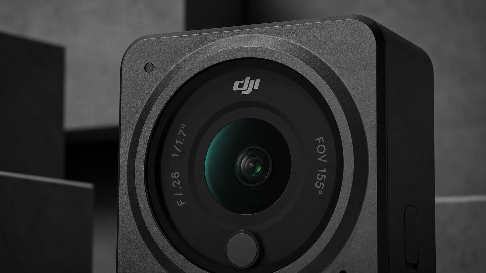
For Neo Systems it meant starting from the object, letting form drive every visual decision made.
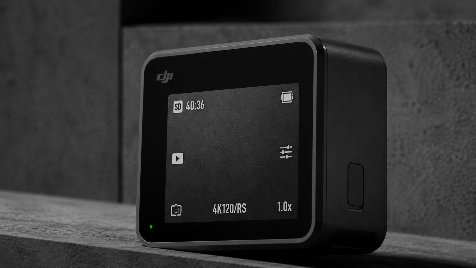
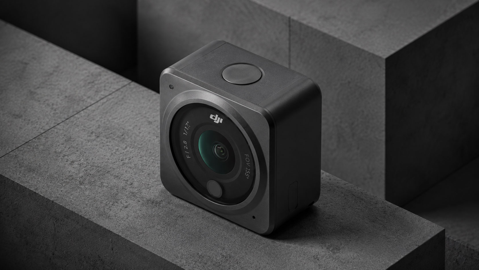
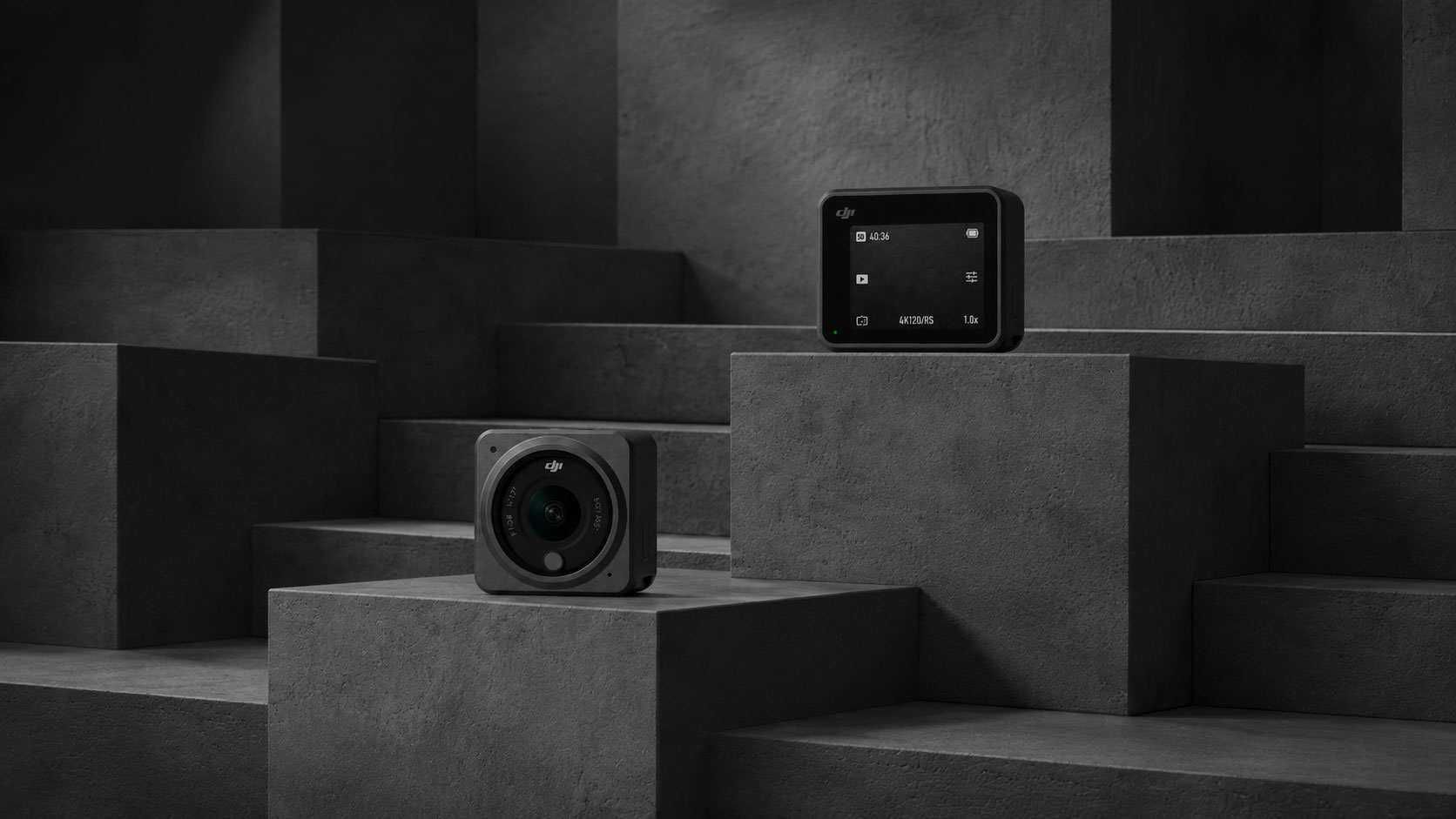
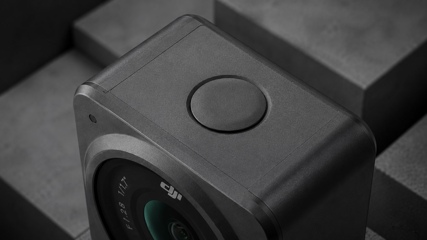
Neo needed a clear position in a crowded market. Not the rugged adventurer, not the technical pro. A camera for people who care as much about design as they do about what they capture.
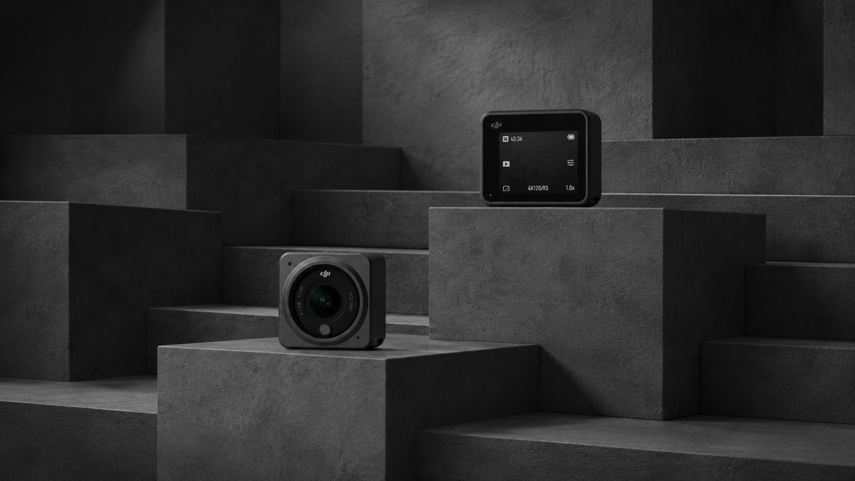
CGI direction focused on restraint. Every frame was built around the product alone, no props, no context added. The geometry of the cube did the work, shadow and light told the rest.
Client
Yolk Footwear
Sector
Branding, CGI Direction, Motion Guidelines
Industry
Consumer Electronics
What does it mean to design for total immersion in a world built on contrast? For Yolk it meant removing every visual anchor, letting color absorb the frame completely, and building a product presence that hits before the eye has time to adjust.



For Yolk it meant letting color absorb the frame before the eye has time to adjust.



Client
Mono Block Inc.
Sector
Branding, CGI Direction, Motion Guidelines
Industry
Consumer Electronics
What does it mean to brand for permanence in an industry that never stops moving? For Mono Block it meant stripping every decorative impulse, letting the material speak first, and building a visual system as durable and direct as the structures the company raises.

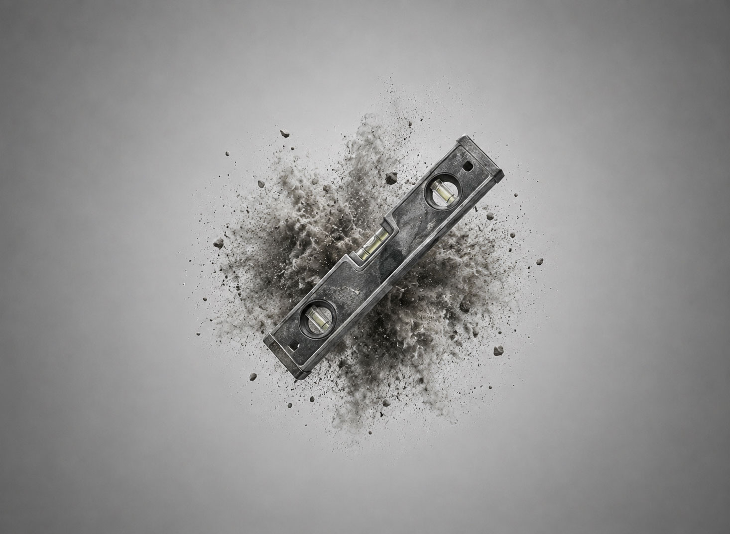
Mono Block needed a presence that felt like the work itself. Not polished, not approachable in the usual sense. A brand for clients who measure trust in tonnes, timelines and things that do not move once they are in place.
CGI direction focused on material impact. Concrete in motion, dust and weight suspended at the moment of force. Every frame built to communicate strength without needing a single word to support it.
Built from the ground up.
The typeface was chosen for its structural weight. Wide, upright, no ornament. Every typographic decision made to reflect the proportions of the materials the company works with every day.
Motion guidelines defined how the brand moves in digital and print. Heavy entries, immediate cuts. Nothing that softens the landing. The brand arrives the same way the company does, with force and without apology.


Client
Kinetic Series Inc.
Sector
Branding, CGI Direction, Motion Guidelines
Industry
Consumer Electronics
What does it mean to make something move without moving it? For Kinetic it meant finding the exact point where stripe frequency and color shift create the sensation of motion in a static frame, and building an entire visual language from that single threshold.