
Client
Vael Watches GmbH
Sector
Branding, CGI Direction, Motion Guidelines
Industry
Consumer Electronics
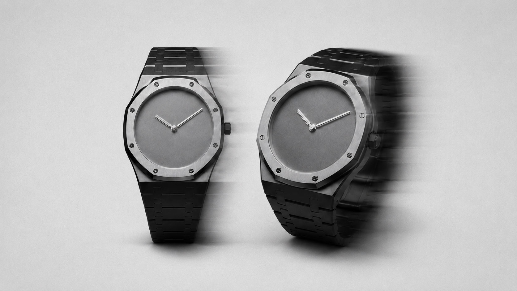
What does it mean to design for silence? For Vael it meant removing every element that competed with the object, until what remained was only intention, material and the quiet confidence of a thing made well.
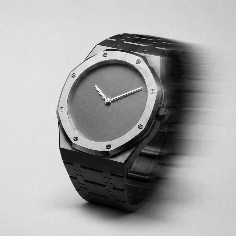
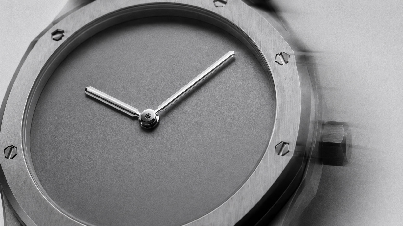
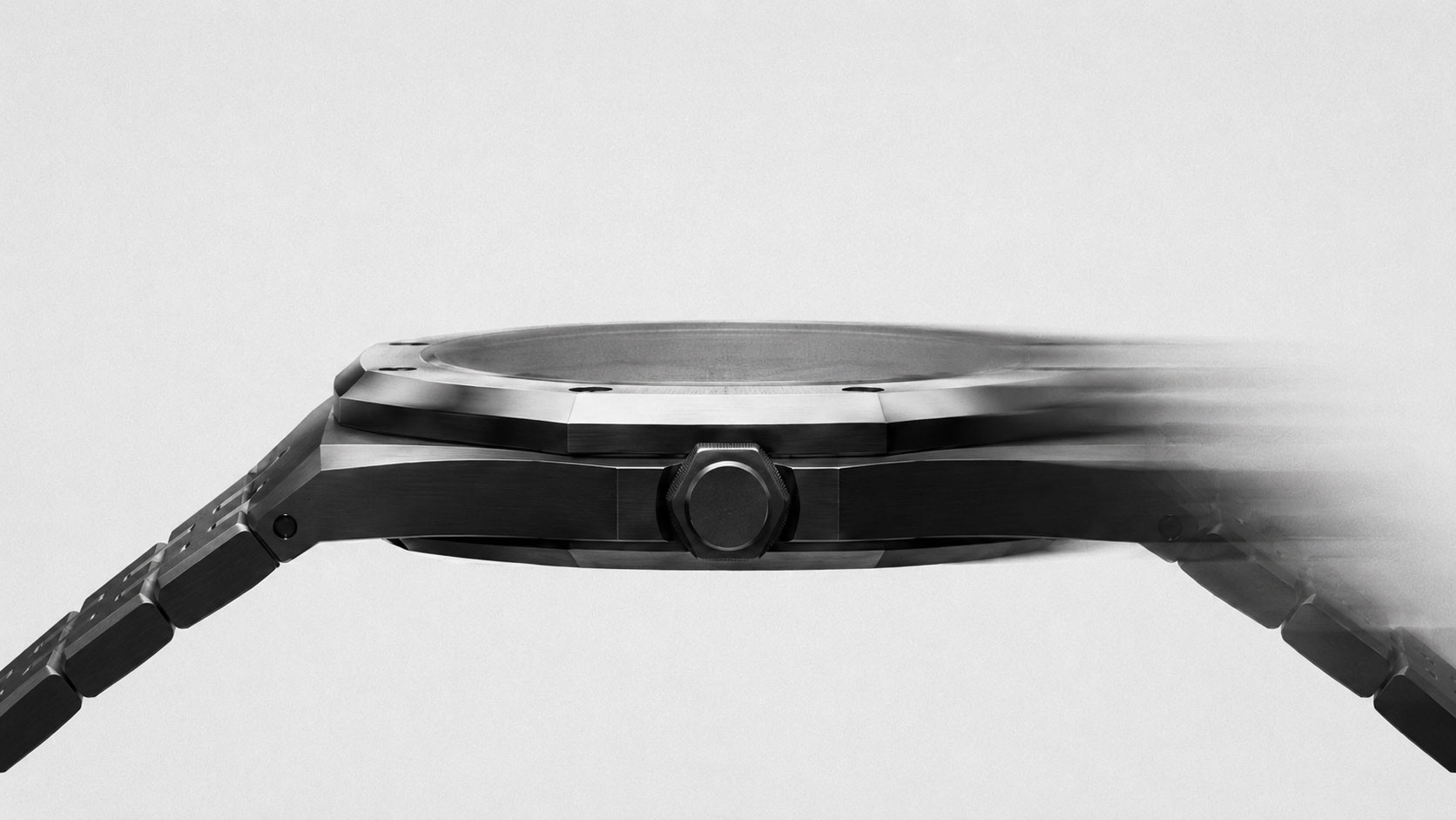
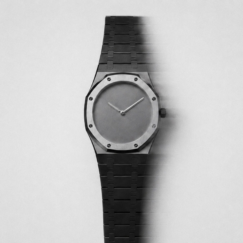
Vael needed a presence that matched the object. Not loud, not minimal for the sake of it. A brand for people who notice the finish of a brushed case, the weight of a crown, the way a hand moves at rest.
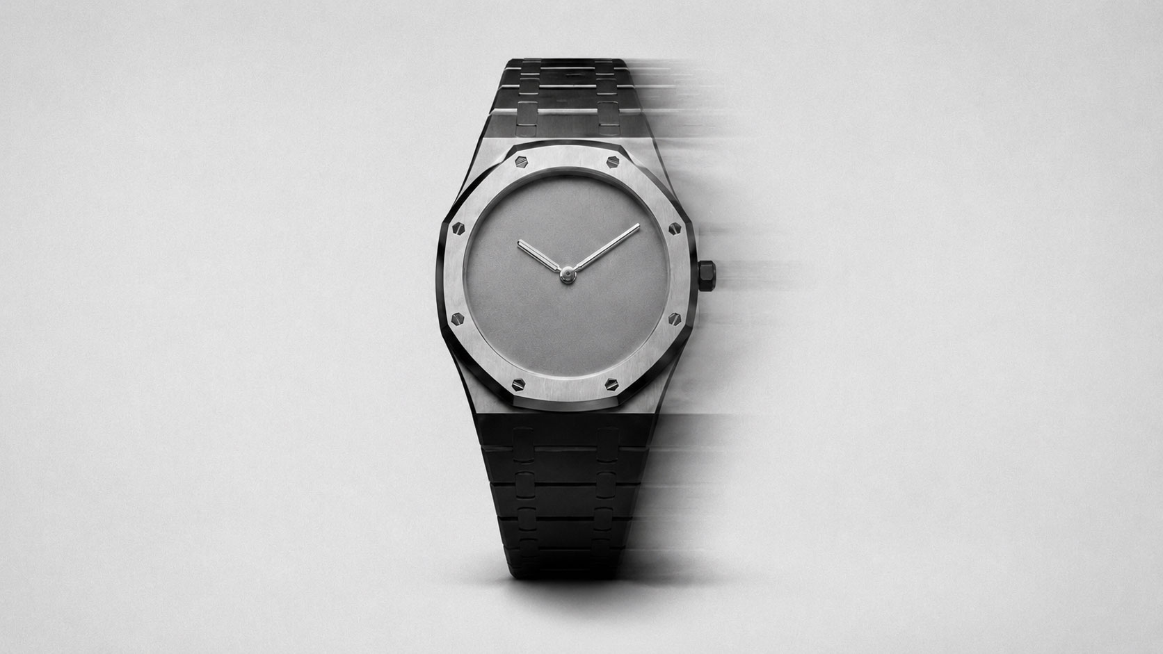
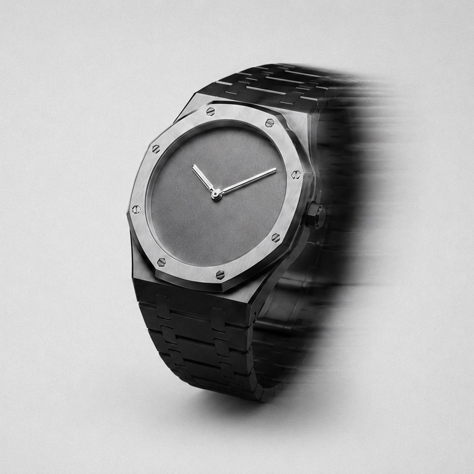
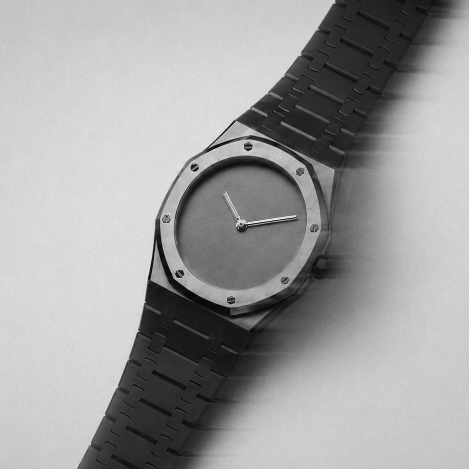
Photography direction used motion blur as the only narrative device. The watch in movement, then frozen. Time as subject, not just product. No lifestyle, no wrist, no context beyond light and speed.
Details that endure.
The typeface was chosen for its geometric neutrality. Nothing that pulls attention from the dial. Every weight and size decision made in reference to the proportions of the case itself.
Motion guidelines defined how the brand moves online and in print. Transitions timed to mirror the sweep of a seconds hand. Slow in, immediate out. Precision without drama.
Client
Arctic Flame Studio
Sector
Branding, CGI Direction, Motion Guidelines
Industry
Consumer Electronics
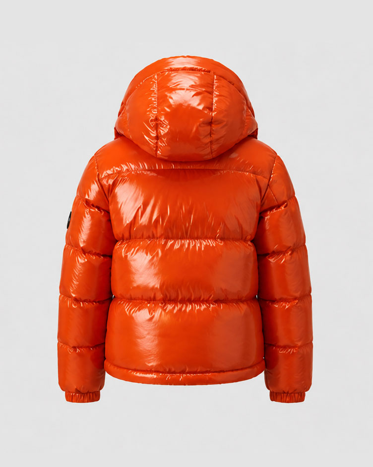
What does it mean to design for volume in every sense? For Arctic Flame it meant treating color as structure, letting the jacket fill the frame completely, and building a brand voice as saturated and direct as the product itself.

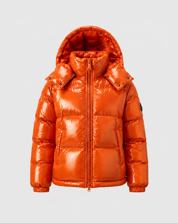
Color was the brief, the set and the only prop. Everything else stepped back until the jacket owned the frame.

Color is the loudest thing
in the room

Photography built each frame around presence, not context. The model, the jacket, the metal surface.