

Client
Thorned Studio
Sector
Branding, CGI Direction, Motion Guidelines
Industry
Consumer Electronics
What does it mean to design for tension? For Thorned it meant holding two opposites at once, fragility and threat, softness and sharp edge, until the uneasy space between them became the brand itself and the only honest answer.
For Thorned it meant holding two opposites, until the space between them became the work.
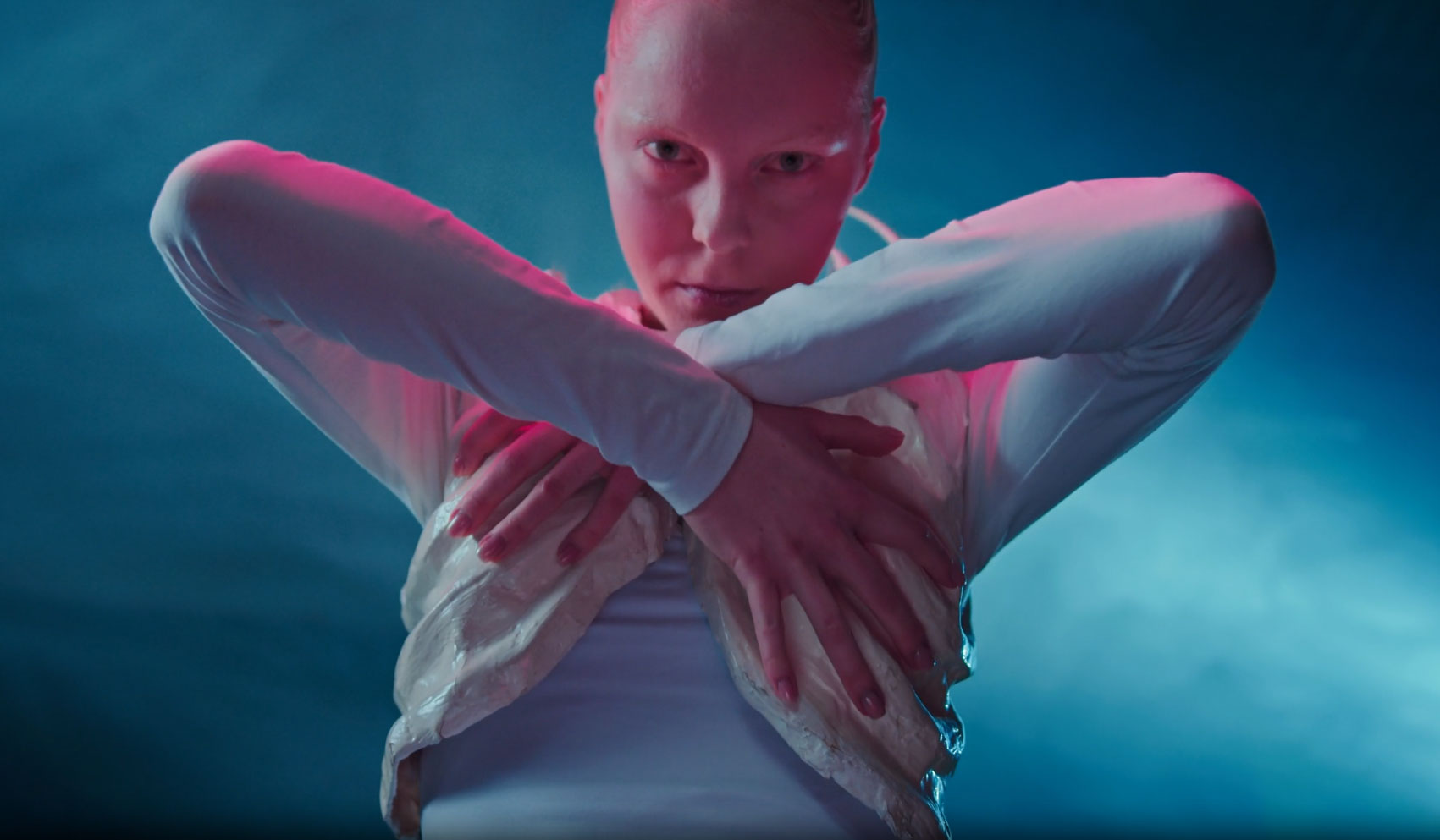
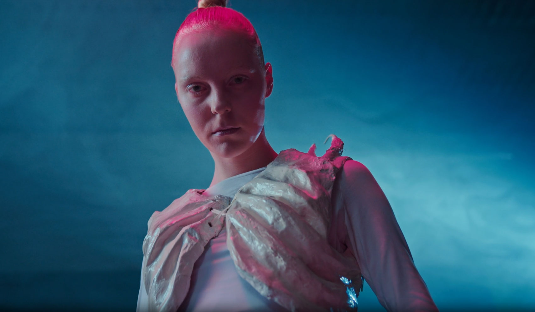
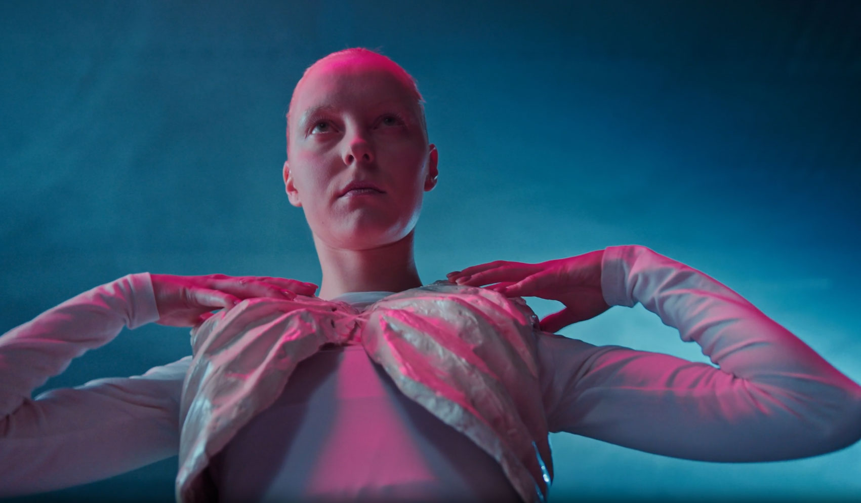
Thorned needed a presence as unsettling as the object itself. Not dark for the sake of it, not fashion in the usual sense. A brand for people who wear things that ask questions before they answer them.
Art direction focused on the body as architecture. Light as the only set. Blue and rose fighting for the same surface. Every frame built to hold the tension without resolving it. Nothing explained, nothing softened.
Client
Expedition — BTS
Sector
Branding, CGI Direction, Motion Guidelines
Industry
Consumer Electronics
What does it mean to document a documentary? For Expedition it meant learning the rhythm of a crew under pressure, earning the right to be in the frame, and building a behind the scenes record as considered and honest as the film it was made alongside.
The terrain does not offer second chances. Every shot was planned around light that lasted minutes and paths that changed by the hour. Coverage had to be fast, invisible and always secondary to the main production.
Camera choices were minimal by necessity. Altitude, dust and distance from any support meant travelling light and making every angle count. The crew became familiar enough to forget we were there, which was exactly the point.
The edit was built to feel like fieldwork, not a promotional piece. Rough cuts held, ambient sound kept, nothing polished beyond what the material asked for. The mountain does the work if you let it.
Final delivery included a short form cut for festival use, a long form archive for the production company and a series of stills cleared for press. Everything made to travel as far as the film itself.